
15 September 2008
21 August 2008
WORKING MEMO 2007 OCT - 《帶著獅子在沙漠中行走》
1.
這裡不是學校,不要總是等著別人指導你或給你什麼。
2.
不要抱怨。
對於你自己已經接受的工作,就拿出能力和責任感做完它。你的工作是解決問題,不是製造問題。
3.
請提高標準要求自己的溝通能力。
請特別注意你的角色和身份,請清楚你跟他人的關係到底是什麼,不要把廠商當客戶,把客戶當笨蛋,把協力單位當成部屬。許多你覺得很「好用」的外面的朋友,都是許多人多年來辛苦經營的人脈,不要使用得那麼理所當然,花時間去想想你的人脈在哪裡?
4.
你的 EQ 很重要,IQ 也很重要。
想讓別人尊重你是個大人物,就不要做一堆小朋友的反應。Senior 與 Junior的差別在哪裡?就是值得信任。
5.
每個人都有為自己想的權利,但是當我們在工作的時候,絕對要以公司的利益為優先考量,這是你進入社會最基本的義務。那就是為什麼我們不會錄取那些面試時「我覺得對這份工作感興趣」的人,而會用「我需要這份工作」或是「我能夠做些麼」的人。
6.
付出。
只有付出才會讓你更以自己為榮。主動幫忙,你就一定會成功。
7.
你的作品就是你。
你很計較很小氣,你的作品就不會大方,你很幼稚很任性,你的作品也絕對不成熟,你不真心,總是做做樣子,你的作品就永遠不會感人。
8.
不要總是等著別人告訴你怎麼去做,等著別人告訴你標準答案。
張學友唱過了,等著別人給幸福的人,往往都過的不怎麼幸福。
9.
我不希望「校稿」是個問題。我不希望「加班」會是個問題。不管你的理由是什麼,你一定還沒有盡全力。
10.
每個人都一樣,沒有什麼人是不能被取代的。
不要總覺得自己特別重要或是特別委屈,想辦法搞定你覺得讓你不舒服的問題,不是等著別人來替你解決,因為別人解決你最快的方式,就是找人取代你。
原文節錄自 《帶著獅子在沙漠中行走》作者:胡至宜。包氏國際有限公司, 2008/01/15 出版
11 August 2008
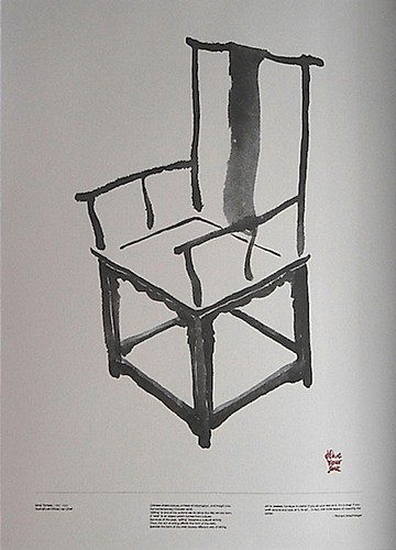
Ming Dynasty Huanghuali Official Hat Chair

Art is useless; furniture is useful.It is the theme of my master project this year in UK.
If you sit your ass on it, it's a chair,
if you walk around and look at it, it's art...
In fact, the more layers of meaning the better.
Richard Artschwager
The original inspiration came form the course I attended last year, called 'Chinese Literati Aesthetics'.
Here is the previous article I wrote about the course.
I am looking forward to introducing the inner thoughts of Chinese culture through a chair, a Ming style chair.
Chinese chairs convey a mass of information, and insight into the contemporary Chinese spirit.
‘Sitting’ is one of the actions we do since the day we are born.
A ‘seat’ is an object which comes from culture.
Because of the seat, ‘sitting’ became a cultural activity.
Thus, the act of sitting affects the form of the seat,
likewise the form of the seat causes different way of sitting.
(translated from 《一章木椅》)
18 July 2008


9 July 2008
Letter by Letter: An Alphabetical Miscellany

Letter by Letter: An Alphabetical Miscellany
Letters are the building blocks of our language, and quite possibly of our consciousness. Written into young minds through constant repetition, letters soon function like water in a fishbowl–essential for life, but too familiar to qualify as objects of serious inquiry. But considered separately from words and sentences, letters express their own mysterious beauty. In order to uncover their secrets, it is necessary to forego the conventional historical approach in favor of an impassioned appreciation of their formal and sensual characteristics.
In Letter by Letter graphic designer and calligrapher Laurent Pflughaupt analyzes each letter of the Roman alphabet in detail, tracing its origin, evolution, and form, as well as discussing its important abbreviations, symbols, and associated meanings. Arranged in alphabetical order, twenty-six entries offer a wealth of facts about each letter, establishing correspondences between letters and elements borrowed from a variety of different fields of study, ranging from traditional paleography, phonetics, and graphic arts to the more arcane areas of musicology, esotericism, and even Eastern philosophy. In addition to a glossary, timelines and images allow us to visualize the letters during the different historical eras, giving the reader an appreciation of their successive metamorphoses. Written as an homage, this lovingly illustrated book takes a broad approach to the modern alphabet, allowing the reader to see letters anew, in a fresh and lively manner guaranteed to inform and enchant anyone interested in typography and language.
Original contest and image: Princeton Architectural Press

Printwork
—Capture the best publication and promotion
Edited by Victionary
Designers have various styles. As the old saying goes, to each his own. But they are all driven by the desire to make a mark in their profession. Printwork may just do the trick. They allow designers to put their personal stamp on print work, notably publications and promotional materials. Designers distinguish themselves with their works using techniques such as special printing effects. Printwork devotes itself to documenting publications and promotional items such as catalogues, identity, leaflets, packaging, name cards, brochures and more. Whether you are a die hard print work fan or just curious about the trade, you may just find your little prints here.

Type Addicted
—The new trend of A to Z typo-graphics
Edited by Victionary
From 2D to 3D design, types are another key visual besides pure graphics and illustration. How to deal with types is a common challenge among designers/artists from various design disciplines. We are excited to present you our latest title Type Addicted which shows you the new trend of A to Z typo-graphics.
Type is one of the graphic elements that designers always get addicted to play with. It is commonly used on almost every item in our daily life. The title not only presents a rich selection of experimental and inspirational typefaces and its application, it also reveals the diversity and innovative approaches of contemporary typography. Examples of work by up-and-coming practitioners as well as international and renowned icons are demonstrated; new directions and trend of nowadays typography around the world will also be disclosed eventually. This is truly developed for type addicts!
Original context and image: Viction: ary
79 Short Essays on Design

To find it more, Please visit
http://blog.pentagram.com/79-short-essays/
http://www.designobserver.com/archives/entry.html?id=25413
1 June 2008

How to work better

How to work BETTER (original image from CreativeReview)
1. Do one thing at one time.
2. Know the problem.
3. Learn to listen.
4. Learn to ask questions.
5. Distinguish sense from nonsense
6. Accept changes as inevitable.
7. Admit Mistakes.
8. Say it simple
9. Be Clam.
10. Smile.
I even couldn't check any one above...
Maybe just start it from the first one at the bottom...
16 May 2008
SUROCUK 第33屆專屬 LOGO 票選活動!
幫旅英同學會的團體做LOGO票選,共計五個圖案(個人提供最後四個),
都已經放上 FaceBook 相本 裡了。
如瀏覽過後,請 回覆此篇 作為投票證明呦~
::: 註明 A - E 您喜歡哪一個即可 :::
咳,基本上自己不是這麼喜歡寫設計理念,
總覺得八股至極,又往往無法像圖形直接地提供具體的感受。
Anyway, 無法投票的朋友,我也希望能了解你們的看法...

讓只有兩人的後防團隊能發揮最堅實的戰力。


感謝小李子的專業評論:
都已經放上 FaceBook 相本 裡了。
如瀏覽過後,請 回覆此篇 作為投票證明呦~
::: 註明 A - E 您喜歡哪一個即可 :::
咳,基本上自己不是這麼喜歡寫設計理念,
總覺得八股至極,又往往無法像圖形直接地提供具體的感受。
Anyway, 無法投票的朋友,我也希望能了解你們的看法...

A感謝 Ying 同學勇敢承接和我同組患難的風險,且提供無比支援,
將台灣語英國的簡稱相融,以呈現留學生體驗東西文化後所衍生出嶄新的世界觀與生活方式。利用圖層堆疊,從黃色的 SU、淺藍 ROC、紅 UK 來表現相溶、互融與共榮的想法。所得到的色彩、造型正可以表現每一位留學生心裡對文化上新的發酵。除了保有「從哪來」的結構,也可以演化成不同的新眼界。designed by Ying.
讓只有兩人的後防團隊能發揮最堅實的戰力。

B
以毛筆完成水墨/水彩的視覺意象,
燃燒我們心中對異地遊子關懷的熱情。

Let's ROCK! (C)
SUROCUK 的發音近似於 "rock" 包含其中。
年輕嘛,就是要充滿活力!
Let's ROCK! Go SUROCUK!

Let's ROCK! (D)
延伸 ROCK 精神
以簡單幾何方式重組字體結構,提供較為中性與具備現代感的圖騰。
Let's ROCK! Go SUROCUK!

E
“這次來英國多久?“
“只有一年..“
砰!(蓋章聲)
“Welcome on board! 不論你來多久,在英國有我們 SUROCUK 罩你。"
感謝小李子的專業評論:
以設計者目前的排放方式而論,選項 E.的表現最為出色。
但若將 logo 日後的使用延伸性考慮進去,
視覺效果也不錯的選項 D.則較 E.更為合適。
Subscribe to:
Posts (Atom)