6 October 2010
Manchester Visitor Information Center
Manchester Visitor Information Center
想像如果台北市的旅遊諮詢中心能有這樣完整度的表現
(以及正確使用合適的科技),相信形象應該會更好。
7 August 2010
27 June 2010
[食] 淡水_黑店
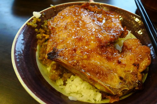
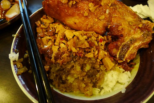
我可以這麼武斷地推論:
本店的行銷策略是
現在台灣人口味洋化,很難再讓味蕾回歸記憶的起點、童年的氛圍,尤其是
市場上各家餐廳在技法、份量與價格上拼殺慘烈,不時又加入異國料理的圍剿,
如何才能異軍突起呢?
只有兩個字: 「平凡中的平凡!」
真的沒特別好吃,又油!
但你就是很難在這一片綠油油的健康飲食主義中,
再次輕巧勾起屬於你那童年消散的片段回憶:
扒一口酸菜拌肉醬、撕一口滿嘴油滋滋但緊實的排骨肉,
當這巷口滋味找上你時,
你也找回20年前的自己。
15 April 2010
10 April 2010
18 March 2010
15 March 2010
3 February 2010
陳文茜號召 七大產業力挺環保片
在陳文茜的號召下,演藝圈與商業圈具影響力的名人紛紛跟進,一起響應環保紀錄片《±2℃紀錄片—臺灣必須面對的真相》的拍攝。周杰倫更為廣播公益廣告獻「聲」,感性說:「當全球暖化失控,海平面持續上升,我們不但要和一寸一寸、沉入大海的故鄉道別,也要準備和自己的未來道別!」
本紀錄片獲台灣七大龍頭產業支持,包括鴻海郭台銘、廣達林百里、台達電鄭崇華、聯發科蔡明介、裕隆集團嚴凱泰、趨勢科技張明正、華碩施崇棠。連綜藝大姊大張小燕也為此發聲,「給下一代一個可以『站立』的土地,是我們的責任。」還有趙少康、王偉忠、五月天、蘇打綠、張懸、王力宏、陶晶瑩、蔡康永、唐湘龍等名人參與。本片將於 22 日晚間7點 22 分於臺北市花卉博覽會舞蝶館舉行全球首映
本紀錄片獲台灣七大龍頭產業支持,包括鴻海郭台銘、廣達林百里、台達電鄭崇華、聯發科蔡明介、裕隆集團嚴凱泰、趨勢科技張明正、華碩施崇棠。連綜藝大姊大張小燕也為此發聲,「給下一代一個可以『站立』的土地,是我們的責任。」還有趙少康、王偉忠、五月天、蘇打綠、張懸、王力宏、陶晶瑩、蔡康永、唐湘龍等名人參與。本片將於 22 日晚間7點 22 分於臺北市花卉博覽會舞蝶館舉行全球首映
為了減碳愛地球,請一起響應中央政府環保署的「一人一日減碳一公斤」
http://ecolife.epa.gov.tw/Cooler/flash/eco2_main_02.html
21 January 2010
11 January 2010
[分享] Urban Street Art: Green Graffiti (12 pics)__"綠"塗鴉
塗鴉,在英語中無論單數或複數,
均由義大利文借用得來,並且都是起源於希臘文γραφειν (graphein),意指「書寫」。
而「書寫」,是帶有意識,也帶有傳達訊息的企圖。
昔日塗鴉多半蘊含反社會、針砭生活中某種程度的忽視,
但這綠塗鴉似乎還挺溫和且正面。
作者 Edina Tokodi 除了表達對環境關注的創作目的外,還期許帶出人與自然的「觸覺關係」。
作品意圖吸引行人進行觸摸與感受的感官行為,進而提醒水泥叢林的都市人對於動物或自然關係的疏離。
然而,已經在全世界各地放置的作品,藝術家也刻意任由它們自然生長,也算是表現生命的另一種張力。
(希望花博也能找到類似的藝術作品參展...)

Using "green guerrilla tactics," eco-minded street artist Edina Tokodi brings nature closer to city dwellers through her living works of art. Unlike most other types of art forms, her site-specific moss installations are meant to be touched, felt.
"City dwellers often have no relationship with animals or greenery," says Tokodi. "As a public artist I feel a sense of duty to draw attention to deficiencies in our everyday life. As a cultivator of eco-urban sensitivity, I usually go back to the sites to visit my 'plants' or 'moss,' sometimes to repair them a bit, but nothing more generally as they tend to get enough water from the air, condensation, and rain – especially in certain seasons."
"I also like to let them live by themselves. From the moment I put them on the street they start to have their own life. For me, the reaction of life on the street is also very important. I am curious about how people receive them, if they just leave them alone, or if they want to, take care of them or dismantle them."
Tokodi studied graphic art and design at the Hungarian Academy of Fine Arts and also completed urban design course work in Milan, Italy. She currently lives in Brooklyn, New York.
Edina Tokodi's website
"City dwellers often have no relationship with animals or greenery," says Tokodi. "As a public artist I feel a sense of duty to draw attention to deficiencies in our everyday life. As a cultivator of eco-urban sensitivity, I usually go back to the sites to visit my 'plants' or 'moss,' sometimes to repair them a bit, but nothing more generally as they tend to get enough water from the air, condensation, and rain – especially in certain seasons."
"I also like to let them live by themselves. From the moment I put them on the street they start to have their own life. For me, the reaction of life on the street is also very important. I am curious about how people receive them, if they just leave them alone, or if they want to, take care of them or dismantle them."
Tokodi studied graphic art and design at the Hungarian Academy of Fine Arts and also completed urban design course work in Milan, Italy. She currently lives in Brooklyn, New York.


Edina Tokodi's website
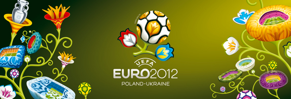
[分享] UEFA EURO2012_2010世界盃足球賽(後續)
這真的是一個適合「足球」活動的主題嗎?
雖然我知道舉辦地點在南非,或多或少可以賦予圖騰的元素...
說不定設計者希望表達一個「多情又溫柔」的比賽氣氛吧 XD
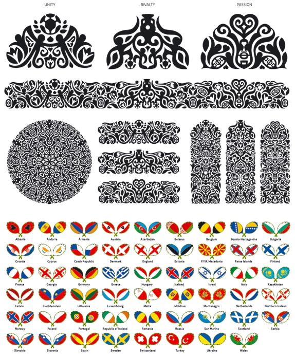
A kind representative from Brandia Central sent us additional visuals of the UEFA EURO 2012 identity. I know what you're thinking — "Ooh purty." (Or maybe not). Either way, the question remains, are they appropriate to the sport of football? The only set that stood out is the black and white set for its intricate craftsmanship. As contrived as they may seem, they do pay homage effectively to Wycinanki. And like Wycinanki, they are mere decorations for a competition of champions.

original post from Brand New
10 January 2010
[Branding] UEFA EURO2012_當世足和花卉結合...
結論如同筆者所言:「執行進網得分,概念想法卻得了張紅牌」

The Union of European Football Associations has been around since 1954. It is comprised of 53 European associations and is headquartered in Nyon, Switzerland. Almost always referred to by its acronym UEFA, it organizes several national and club-level competitions across Europe. The largest of six continental confederations of the French Swiss organization FIFA (Federation Internationale de Football Association), UEFA is also the wealthiest and most influential over the game of football. Since 1960, UEFA has held one of their Pan European competitions, the UEFA European Football Championship, every four years in member countries. In 2000, for the first time, the tournament was held by two neighboring countries, Netherlands and Belgium. The trend stayed and the last competition in 2008 was in Austria and Switzerland. In 2012, the games will be held by neighbors Poland and Ukraine. A first for Central and Eastern Europe.
Visual identity
The purpose of the logo is to give UEFA EURO 2012™ a personality of its own, with the visual identity to be applied across a range of promotional applications from tickets to web banners. The objective is to help promote the tournament - one of the world's biggest sporting events - by providing an easily recognisable identity with a flavour of the host nations. The logo takes its visual lead from 'wycinanka', the traditional art of paper cutting practised in rural areas of Poland and Ukraine, as a tribute to the fauna and flora of the region.
EURO bloom
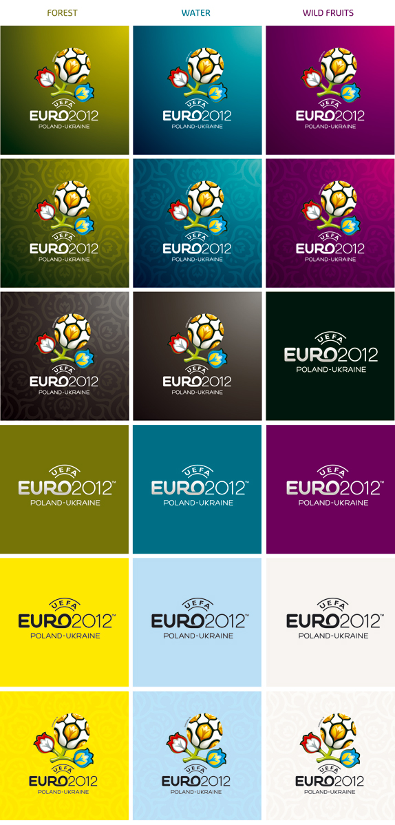
The 'bloom' logo has a flower representing each of the co-host nations and a central ball symbolising the emotion and passion of the competition, while the stem denotes the structural aspect of the competition, UEFA and European football. Nature has inspired other features of the visual identity, with woodland green, sun yellow, aqua blue, sky blue and blackberry purple being the crucial tones of the palette of colours to figure in official tournament branding.
— Press Release
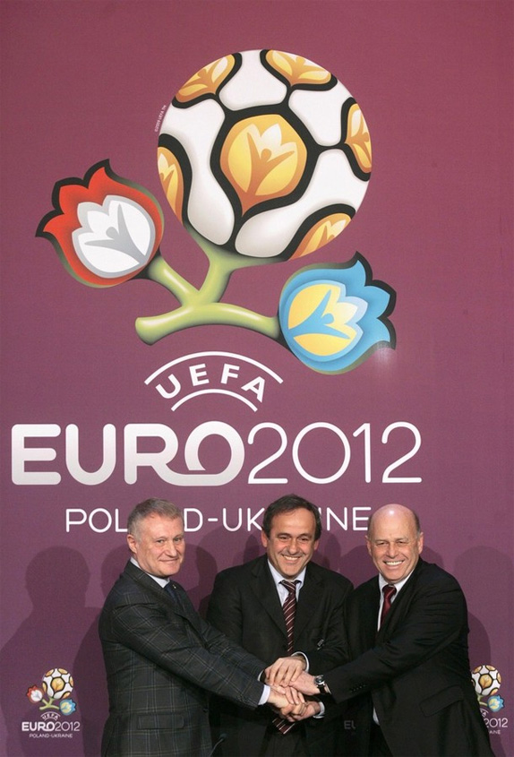
UEFA President Michel Platini (C), Poland Soccer Federation President Grzegorz Lato (R) and Ukrainian FA president Grigoriy Surkis attend a news conference. Image source: Daylife.
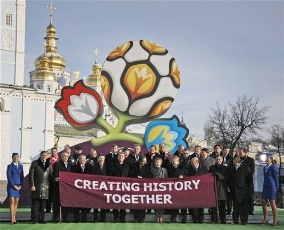
The official logo and slogan, "Creating History Together", for UEFA EURO 2012™ was revealed earlier this week in Ukraine. According to UEFA, "the purpose of the logo is to give UEFA EURO 2012™ a distinct personality…". They also mention that the visual identity should have easy recall and cultural references. They plan on promoting this "[…] as one of the world's biggest sporting events. My friends, it is worth mentioning that this event is a huge deal for UEFA and the host nations.
The Gravity Fighting Portuguese firm Brandia Central created the identity. I contacted Brandia Central to get more images of the brand extension but there was no response from them. Their video, above, shows the thought process behind the development of the identity as well as how they plan on using the visuals — standard stuff. At 0:25 in the video (and the images above) you can see the forms that represent a cultural reference — Wycinanki patterns, common to Poland and Ukraine. Vaguely similar to Origami, it is a decorative art-form that consists of cutting and folding brightly colored pieces of paper. Very interesting. The logo, deemed "EURO bloom," is made up of a floral motif with a football in the centre. Umm, boring. Other features of the identity have been attributed to the native flora and fauna. Yawn. The stem of the flower is meant to symbolize the structural aspect of the competition. Zzz.
Above, logo unveiling. Embedded disabled, but you can click quickly through it this way. Below, still image from the unveiling… Is that Verdana on that banner?! Image source: Daylife.
In my opinion, the UEFA EURO 2012™ logo is much softer and emotional in feel compared to the logo from 2008. That, it seems, was the intention. Even though, like Wycinanki, the forms contain bright and highly saturated colors, culturally, it doesn't drive the ball deep enough into the net. They should have left those edges straight — as seen in traditional Wycinanki. It completely misses the net as far as capturing the spirit and energy of football. It seems heavily catered to multimedia — some 8 billion viewers in all followed UEFA EURO 2004™ on TV (source, PDF) — with its glossy and glowing finish. It has a heavy consumer appeal (perhaps UEFA are looking to cash in on sales of official merchandise). I did like the fact that they incorporated the national colors of both nations in the logo. Overall, the logo is very well executed with questionable typographic treatment — why is the "R" trying to lob the "O"?
Moral of the story: it is always better to kick around a great concept that has been terribly executed rather than driving a beautifully executed logo without legs. Concept gets Red Card. Execution Scores.
![]()
![]()
![]()
Update: Official logos, above. Thanks to Volodymyr for the tip.
Clyde Araujo is a freelance Art Director and Graphic Designer with professional design experience in USA, India and Germany. He advocates creative communications for strategic intent. He lives in Germany and is pursuing new business opportunities. Clyde is an international correspondent for Brand New.
Thanks to Ivan Philipov for first tip.
Subscribe to:
Posts (Atom)