21 January 2010
11 January 2010
[分享] Urban Street Art: Green Graffiti (12 pics)__"綠"塗鴉

"City dwellers often have no relationship with animals or greenery," says Tokodi. "As a public artist I feel a sense of duty to draw attention to deficiencies in our everyday life. As a cultivator of eco-urban sensitivity, I usually go back to the sites to visit my 'plants' or 'moss,' sometimes to repair them a bit, but nothing more generally as they tend to get enough water from the air, condensation, and rain – especially in certain seasons."
"I also like to let them live by themselves. From the moment I put them on the street they start to have their own life. For me, the reaction of life on the street is also very important. I am curious about how people receive them, if they just leave them alone, or if they want to, take care of them or dismantle them."
Tokodi studied graphic art and design at the Hungarian Academy of Fine Arts and also completed urban design course work in Milan, Italy. She currently lives in Brooklyn, New York.


Edina Tokodi's website
[分享] UEFA EURO2012_2010世界盃足球賽(後續)
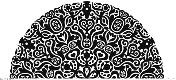
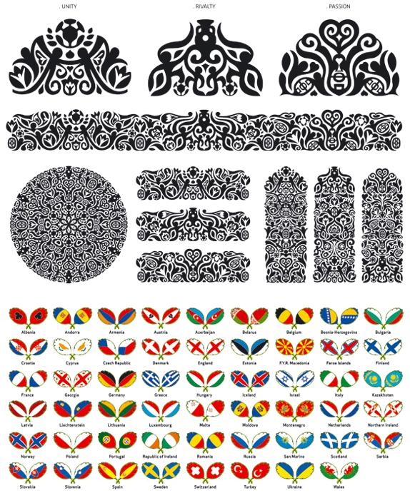
A kind representative from Brandia Central sent us additional visuals of the UEFA EURO 2012 identity. I know what you're thinking — "Ooh purty." (Or maybe not). Either way, the question remains, are they appropriate to the sport of football? The only set that stood out is the black and white set for its intricate craftsmanship. As contrived as they may seem, they do pay homage effectively to Wycinanki. And like Wycinanki, they are mere decorations for a competition of champions.

10 January 2010
[Branding] UEFA EURO2012_當世足和花卉結合...
The Union of European Football Associations has been around since 1954. It is comprised of 53 European associations and is headquartered in Nyon, Switzerland. Almost always referred to by its acronym UEFA, it organizes several national and club-level competitions across Europe. The largest of six continental confederations of the French Swiss organization FIFA (Federation Internationale de Football Association), UEFA is also the wealthiest and most influential over the game of football. Since 1960, UEFA has held one of their Pan European competitions, the UEFA European Football Championship, every four years in member countries. In 2000, for the first time, the tournament was held by two neighboring countries, Netherlands and Belgium. The trend stayed and the last competition in 2008 was in Austria and Switzerland. In 2012, the games will be held by neighbors Poland and Ukraine. A first for Central and Eastern Europe.
Visual identity
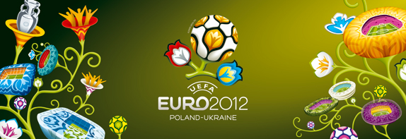
The purpose of the logo is to give UEFA EURO 2012™ a personality of its own, with the visual identity to be applied across a range of promotional applications from tickets to web banners. The objective is to help promote the tournament - one of the world's biggest sporting events - by providing an easily recognisable identity with a flavour of the host nations. The logo takes its visual lead from 'wycinanka', the traditional art of paper cutting practised in rural areas of Poland and Ukraine, as a tribute to the fauna and flora of the region.
EURO bloom
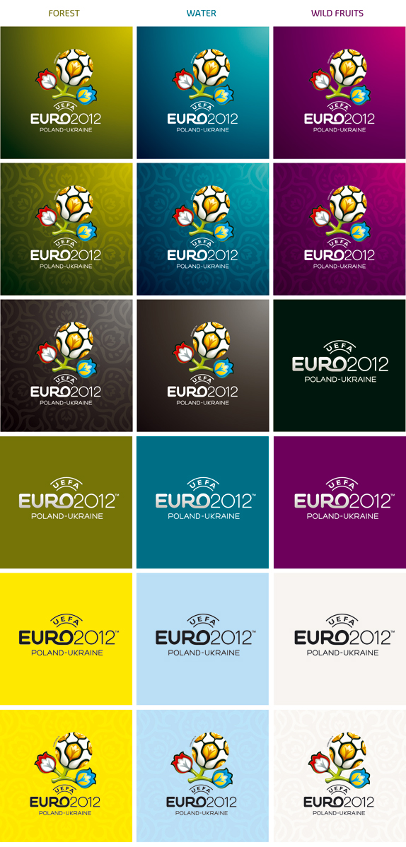
The 'bloom' logo has a flower representing each of the co-host nations and a central ball symbolising the emotion and passion of the competition, while the stem denotes the structural aspect of the competition, UEFA and European football. Nature has inspired other features of the visual identity, with woodland green, sun yellow, aqua blue, sky blue and blackberry purple being the crucial tones of the palette of colours to figure in official tournament branding.
— Press Release
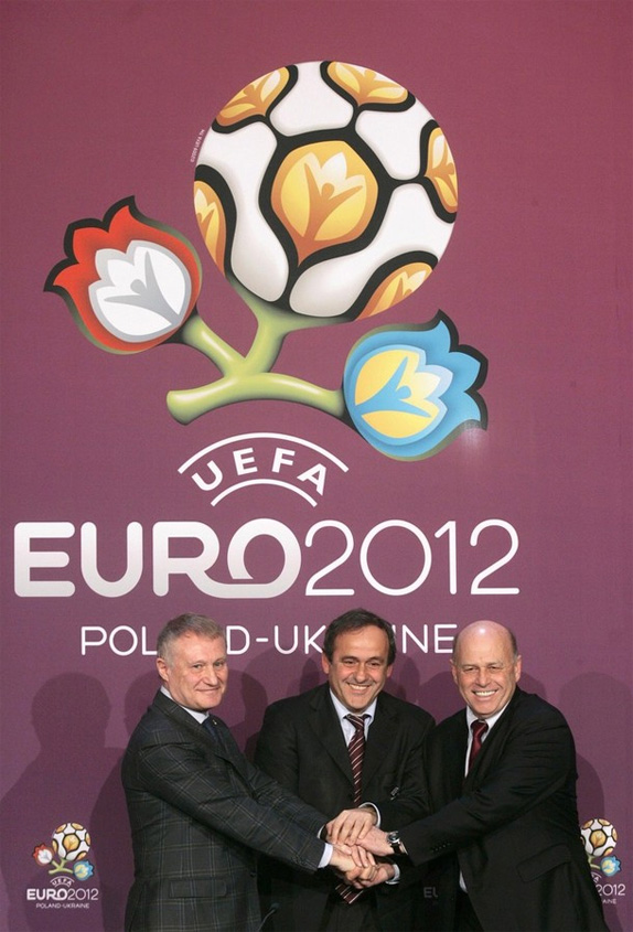
UEFA President Michel Platini (C), Poland Soccer Federation President Grzegorz Lato (R) and Ukrainian FA president Grigoriy Surkis attend a news conference. Image source: Daylife.
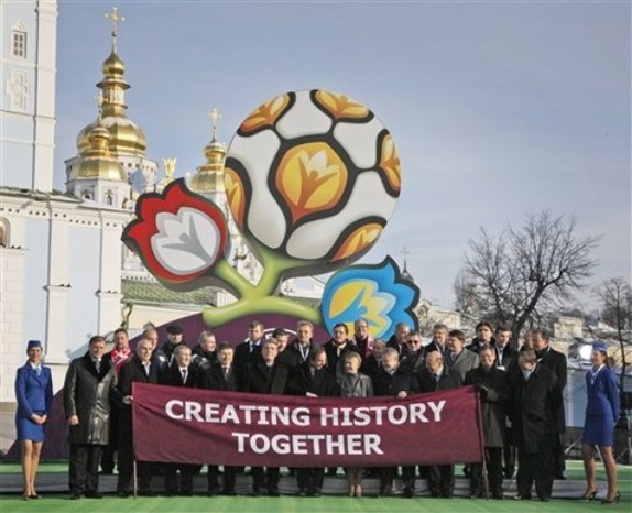
The official logo and slogan, "Creating History Together", for UEFA EURO 2012™ was revealed earlier this week in Ukraine. According to UEFA, "the purpose of the logo is to give UEFA EURO 2012™ a distinct personality…". They also mention that the visual identity should have easy recall and cultural references. They plan on promoting this "[…] as one of the world's biggest sporting events. My friends, it is worth mentioning that this event is a huge deal for UEFA and the host nations.
The Gravity Fighting Portuguese firm Brandia Central created the identity. I contacted Brandia Central to get more images of the brand extension but there was no response from them. Their video, above, shows the thought process behind the development of the identity as well as how they plan on using the visuals — standard stuff. At 0:25 in the video (and the images above) you can see the forms that represent a cultural reference — Wycinanki patterns, common to Poland and Ukraine. Vaguely similar to Origami, it is a decorative art-form that consists of cutting and folding brightly colored pieces of paper. Very interesting. The logo, deemed "EURO bloom," is made up of a floral motif with a football in the centre. Umm, boring. Other features of the identity have been attributed to the native flora and fauna. Yawn. The stem of the flower is meant to symbolize the structural aspect of the competition. Zzz.
Above, logo unveiling. Embedded disabled, but you can click quickly through it this way. Below, still image from the unveiling… Is that Verdana on that banner?! Image source: Daylife.
In my opinion, the UEFA EURO 2012™ logo is much softer and emotional in feel compared to the logo from 2008. That, it seems, was the intention. Even though, like Wycinanki, the forms contain bright and highly saturated colors, culturally, it doesn't drive the ball deep enough into the net. They should have left those edges straight — as seen in traditional Wycinanki. It completely misses the net as far as capturing the spirit and energy of football. It seems heavily catered to multimedia — some 8 billion viewers in all followed UEFA EURO 2004™ on TV (source, PDF) — with its glossy and glowing finish. It has a heavy consumer appeal (perhaps UEFA are looking to cash in on sales of official merchandise). I did like the fact that they incorporated the national colors of both nations in the logo. Overall, the logo is very well executed with questionable typographic treatment — why is the "R" trying to lob the "O"?
Moral of the story: it is always better to kick around a great concept that has been terribly executed rather than driving a beautifully executed logo without legs. Concept gets Red Card. Execution Scores.
![]()
![]()
![]()
Update: Official logos, above. Thanks to Volodymyr for the tip.
Thanks to Ivan Philipov for first tip.